B
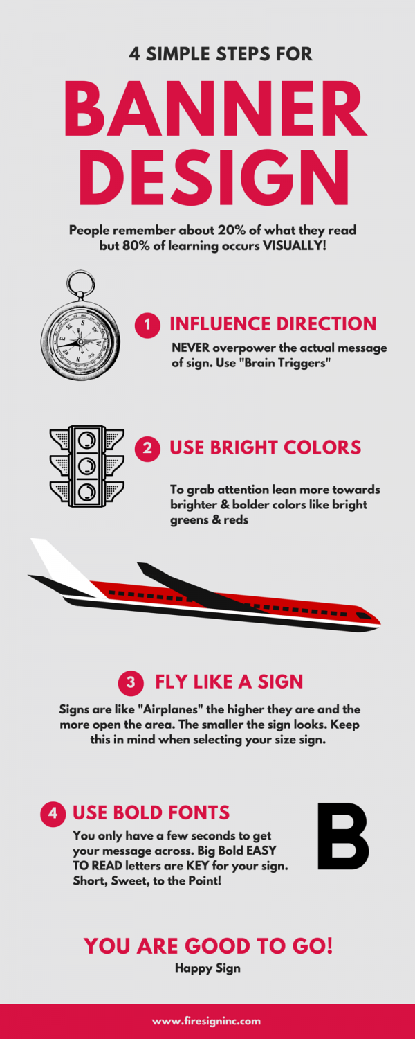
Banners are a form of Visual Marketing.People remember 20% of what they read but about 80% of learning occurs VISUALLY! Images are easier to digest. Visual content helps grab the targeted audience’s attention. Condensing and explaining large amounts of information is key! The brain processes visual information 60,000 faster than the time it takes the brain to decode text.
B
When applying this knowledge keep our infographic (below) in mind.
A few more tips:
Choose colors that support certain triggers and/or the theme of your company in a psychological sense. For example in the psychology of business blue is a sign of confidence and orange is seen as optimism or joy. Starbucks usage of green points toward them having a “healthier”, “greener” product and company. At Firesign our color focus is mostly orange which compliments our as an optimism as a company ” We get business ignited!”. If you you’re looking for your signage to really grasp the attention of your targeted audience lean more towards brighter and bolder colors like yellows, bright greens, and reds.
Banners have various forms! They can be indoor and/or outdoor forms of signage. Materials are selected based upon the condition in which the banner will be displayed. Many outdoor banners are made of vinyl but depending on the style material may vary. For more assistance, we are just an email or a call away!
HAPPY SIGNING!


